


Ah, the bright glow of computer screens. A beacon ...
news-extra-space

 Material.io uses content-based Dynamic Color, which draws on a "collection of artwork spanning in style, color, and topic matter," as opposed to wallpaper-derived Dynamic Color. By having the website reflect the information a reader is reading, the dynamic color transition produces a comprehensive visual experience and showcases Material Design 3's new color scheme, which uses a distinct palette of tones and complements.
With this update, Material.io acquired a dark look, and Google modified essential visuals to react to the various modes. Due to red-green colorblindness, the website likewise avoids using green and instead employs blue or red.
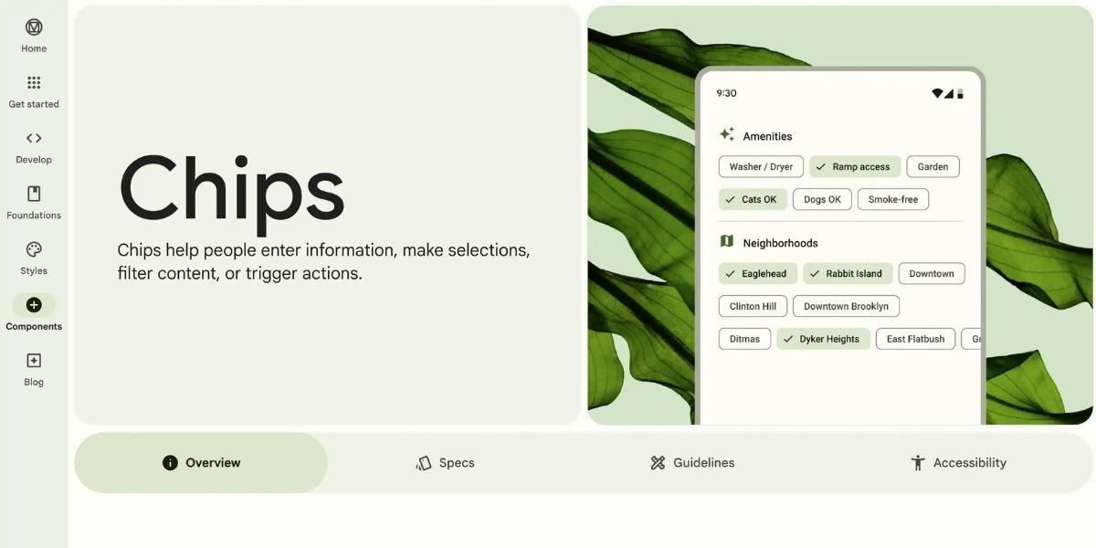
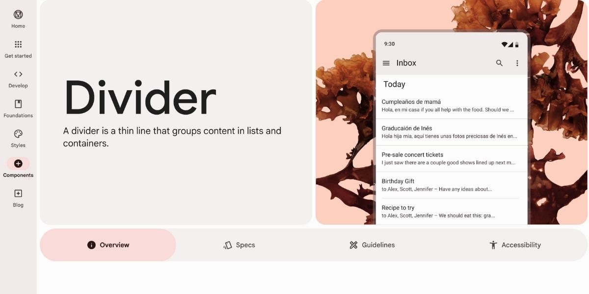
Google "integrated the new navigation rail with the navigation drawer using a simple hover interaction which gives readers a sense of ergonomic speed and swiftly delivers an overview of the site's content with relative simplicity" when it comes to site navigation. The two main types of navigation are tabs and tables of contents.
Material.io uses content-based Dynamic Color, which draws on a "collection of artwork spanning in style, color, and topic matter," as opposed to wallpaper-derived Dynamic Color. By having the website reflect the information a reader is reading, the dynamic color transition produces a comprehensive visual experience and showcases Material Design 3's new color scheme, which uses a distinct palette of tones and complements.
With this update, Material.io acquired a dark look, and Google modified essential visuals to react to the various modes. Due to red-green colorblindness, the website likewise avoids using green and instead employs blue or red.
Google "integrated the new navigation rail with the navigation drawer using a simple hover interaction which gives readers a sense of ergonomic speed and swiftly delivers an overview of the site's content with relative simplicity" when it comes to site navigation. The two main types of navigation are tabs and tables of contents.
 The way Material.io handles bullet points in the form of "cookies" is noteworthy: By randomly rotating them with some basic CSS and applying these forms to bullet points at such a small scale, you may strive for visual expression for the sake of expression rather than rigorous utility.
There are lateral transitions, vertical slides, and full-screen pages on the motion front. Similarly, icons respond by becoming heavier when hovering and lighter when pressed; this again gives them a feeling of magical energy and function. When an item is selected, icons for navigational components populate with content.
The way Material.io handles bullet points in the form of "cookies" is noteworthy: By randomly rotating them with some basic CSS and applying these forms to bullet points at such a small scale, you may strive for visual expression for the sake of expression rather than rigorous utility.
There are lateral transitions, vertical slides, and full-screen pages on the motion front. Similarly, icons respond by becoming heavier when hovering and lighter when pressed; this again gives them a feeling of magical energy and function. When an item is selected, icons for navigational components populate with content.

Leave a Reply


Ah, the bright glow of computer screens. A beacon ...

Are you facing the E87 Steam login error while try...

Google Slides is a popular tool for making and sha...

(Image credit- Gearrice) Blackmagic Design has ...
(Image credit- Tool Finder) You will soon have ...
(Image credit- Tech Times) Field-Programmable G...