Here's a Tutorial on creating a graph in Microsoft Excel
March 29, 2023 By Prelo Con

(Image Credit Google)
Photo Credit: Simplilearn
If you frequently use Excel for schoolwork or a job that requires a spreadsheet to be filled with data-driven information, you are probably aware of how time-consuming and difficult it can be to understand. This is especially true for individuals who are unfamiliar with analytical-based data.
Whether or not spreadsheets are complex, the reality remains that graphs assist organize your data into a more comprehensible format, improving your Excel spreadsheet's overall readability.

Photo Credit: GroovyPost
How to create a graph in Microsoft Excel is explained below.
To insert a graph in Excel, follow these steps:
- Enter your data into the spreadsheet, giving each column a title that is specific to it.
- The cells containing all the information you want to use to fill your graph must be chosen.
- You can choose from a variety of graph template options thanks to a handy function offered by Microsoft Excel. Recommendations charts can be found by clicking the Insert tab.
- Then click OK after selecting a desired graph template.
- The graph can now be modified by altering its title (double-click Chart title), size, colors, etc.
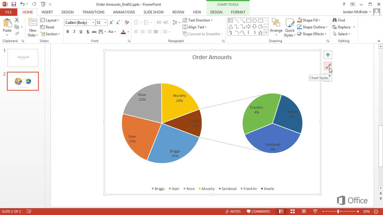
- Selecting one of the icons that appear next to your new graph will allow you to further alter it.
- The plus sign icon is used to add or remove different chart elements, such as the legend or labels. Change your graph's style or color scheme with the paintbrush icon.
You can use the filter icon to restrict which data is displayed in your chart.

Photo Credit: Microsoft Support
- In the window that displays after selecting the Suggested charts option in step 3, click the All charts tab to see a comprehensive list of all the graph kinds you can use. For instance, you can choose from the Bar or Line charts, each of which offers a unique collection of graphics (3D, Clustered, Stacked, and more).
- After selecting a graph type, choose the Chart design tab from the ribbon at the top of your screen, and then click the Change chart type button if you want to alter it.
Typically, the Chart design tab doesn't show up until your current chart is chosen. In order to access the Chart design tab, first choose your current chart from the list that shows at the top of your screen.
- In the Insert tab, under the Suggested charts area, you may also choose a graph type from all the available choices. You can see a preview of your chart's appearance with that particular design by clicking the drop-down arrow next to each chart icon and hovering your cursor over a thumbnail in the menu that displays.
By Prelo Con
Following my passion by reviewing latest tech. Just love it.

 Photo Credit: GroovyPost
How to create a graph in Microsoft Excel is explained below.
To insert a graph in Excel, follow these steps:
 Photo Credit: Microsoft Support


