

In the ever-changing world of technology and retai...
news-extra-space
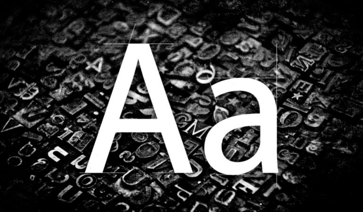
"A font is a subcategory of a typeface if we're being pedantic (AND I AM!). And while changing typefaces may imply that you are also changing the text style you are using, this is not a semantically relevant expression "stated a pretty petty coworker. However, as a less pious coworker noted, "This is one of those glasses pushing up things that people who work with it all disregard on a regular basis." Another third attributed the misunderstanding to the fact that early word processors "labeled distinct typefaces as 'fonts' and fonts as 'font styles'." Prior preferences for typefaces have been made known by other branches of the federal government. For instance, there are specific requirements and formatting requirements if you're submitting a grant application to the National Institutes of Health. [caption id="attachment_82787" align="alignright" width="1200"]big news for font freaks: Times New Roman is being phased out at the State Department & replaced by Calibri. Secretary Blinken sent a cable to all embassies today directing staff not to send him any more papers with Times New Roman. Subject: "The Times (New Roman) are a-Changin" pic.twitter.com/HENLbRH3UQ
— John Hudson (@John_Hudson) January 17, 2023
 linkedin[/caption]
To prevent verbose researchers from trying to cram a dissertation into a R01, there are restrictions on font size, character density, and line spacing of no less than 11 points, 15 characters per linear inch, and six lines per vertical inch. Arial, Georgia, Helvetica, and Palatino Linotype are suggested typefaces, but they are not required—apparently, the top financing body for biomedical research in our country is undecided about serifs versus sans serifs.
The main driver behind this move was not aesthetics. According to a senior State Department official who is acquainted with the move, Hudson writes in The Washington Post that "the secretary's decision was prompted by accessibility difficulties and not aesthetics." Sans serif typefaces are simpler to read on screens than their more ornate counterparts. Sans serif fonts are also less likely to cause issues for users of optical character recognition and text-to-speech software.
[caption id="attachment_82782" align="alignright" width="1200"]
linkedin[/caption]
To prevent verbose researchers from trying to cram a dissertation into a R01, there are restrictions on font size, character density, and line spacing of no less than 11 points, 15 characters per linear inch, and six lines per vertical inch. Arial, Georgia, Helvetica, and Palatino Linotype are suggested typefaces, but they are not required—apparently, the top financing body for biomedical research in our country is undecided about serifs versus sans serifs.
The main driver behind this move was not aesthetics. According to a senior State Department official who is acquainted with the move, Hudson writes in The Washington Post that "the secretary's decision was prompted by accessibility difficulties and not aesthetics." Sans serif typefaces are simpler to read on screens than their more ornate counterparts. Sans serif fonts are also less likely to cause issues for users of optical character recognition and text-to-speech software.
[caption id="attachment_82782" align="alignright" width="1200"] Photo Credit: The Washington Post[/caption]
The typeface Calibri was created by Dutch type designer Lucas de Groot at the turn of the century, therefore it is relatively young. Given that most papers would be viewed on screens rather than in print in the future, it took the place of Times New Roman as the default typeface for Microsoft Word in 2007.
Since Calibri is the standard sans serif font in Microsoft Office, Secretary Antony Blinken instructed his staff to identify a more accessible typeface in January. Though it's possible that Calibri won't always remain the default font in Microsoft Word. We found out that the corporation was looking for replacements in 2021.
Photo Credit: The Washington Post[/caption]
The typeface Calibri was created by Dutch type designer Lucas de Groot at the turn of the century, therefore it is relatively young. Given that most papers would be viewed on screens rather than in print in the future, it took the place of Times New Roman as the default typeface for Microsoft Word in 2007.
Since Calibri is the standard sans serif font in Microsoft Office, Secretary Antony Blinken instructed his staff to identify a more accessible typeface in January. Though it's possible that Calibri won't always remain the default font in Microsoft Word. We found out that the corporation was looking for replacements in 2021.

Leave a Reply


In the ever-changing world of technology and retai...

In a bid to capture the attention of users and dri...
Apple is preparing for a game-changing move with i...
Google has been making huge headways in artificial...
Elon Musk's artificial intelligence firm, xAI, is ...

In a digital showdown that has captured the attent...